Let’s face it: no one is downloading your PDFs, reading your blogs, or watching your videos if they don’t care to find them. And the ever-evolving online world makes it difficult to keep up with trends, algorithms, and your overall competition. Attention spans are getting shorter while the deafening static of the peripheral noise on the internet drowns out your best efforts to communicate your story at scale.
This is why creative teams with a hyper-focus on content are constantly looking for new ways to create interactive and visually compelling stories. When executed correctly, visual storytelling can increase the amount of time people spend on your landing pages, deafen bounce rates, and inspire them to click on that call to action you spent so much time on.
The purpose of storytelling can mean different things to different teams, but the objective is always the same: how do you capture the attention of a broad, diverse audience without saying a word?
Speak Their Language
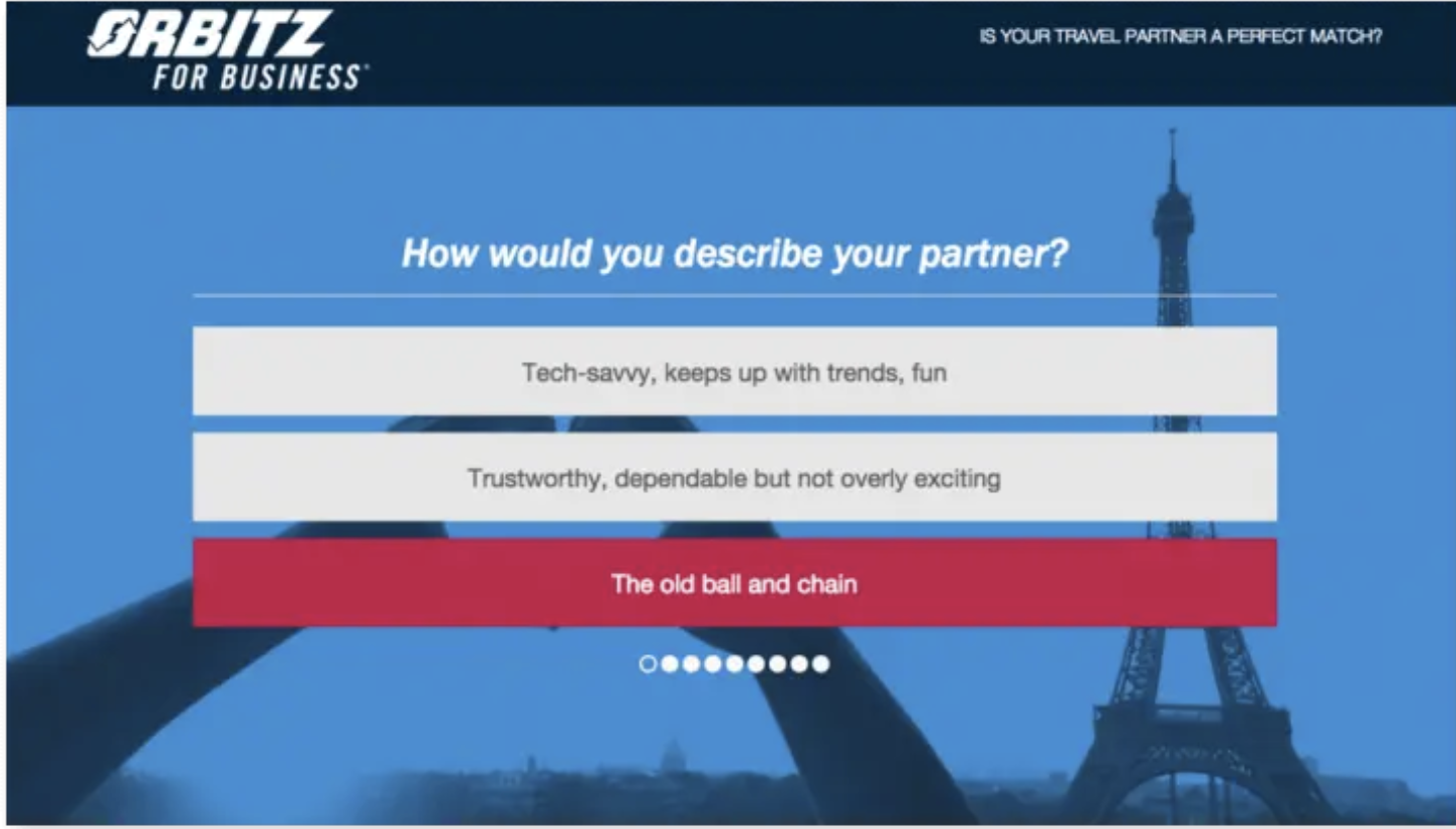
Before putting pen to paper, you have to figure out who you’re trying to talk to. Whether it be a crowded executive boardroom or potential clients, finding out what they care about and how to get on their level is the first step.
People who miss this crucial first step tend to totally miss the mark with their campaigns because they’re talking at their audience, not to. Speaking their language allows you to align your visual storytelling techniques with the expectations and skillset of your target audience. Ultimately, this will lead to better results.

Companies of all sizes struggle with keeping up with their target audience as online media evolves. Traditional media channels aren’t reaping the same results as they once did in the past. To really stand out, you have to take off your salesperson cap and talk human-to-human.
Former editor of BBC News Magazine Giles Wilson explained it best: most readers, and human brains, don’t respond to overly complex “content experiences.” Make their journey as simple as possible.
Giles says: "Don’t make me click about the page. If you insist that I have to make more than one click, don’t make me move my mouse as well. I want all my clicks in the same place. Got that? The most I will do for you is scroll."
It’s safe to assume that all your readers will do the same.
Make it Interactive
Imperial College London showed that their time-on-page increased by 50% after they published their digital magazine with interactive visual elements. This is largely because interactive elements such as videos, polls, and quizzes aid in keeping your audience’s attention.

There is a delicate balance that needs to be kept in mind when employing interactive elements. If you don’t have enough or any at all, you’ll lose your audience faster. If you have too many, you’re more than likely going to confuse or overwhelm them. Keeping the interactive elements to a minimum of two or three is a safe bet.
Try Data Visualizations
You and your team more than likely spend hours out of your work week collecting data around your various campaigns. Use it! If you have any useful or interesting data to share with your audience, putting it at the front and center of your story boosts authority and creates a compelling argument for the point you’re trying to get across.
A commonly used tactic is to create an infographic.

If you’re feeling fancy, you can try more advanced tactics including R, Tableau, and a range of open-source developer tools. If you don’t have a robust developer resource, you can still create a powerful story with interactive maps, charts, and graphs. With tools like Shorthand, anyone can create a powerful data visualization using several static images.
Shorthand enables you to create immersive digital stories that will keep your audience scrolling for more (or, as they call it, “scrollytelling”). You can create rich no-code data visualizations, including interactive maps, charts, and graphs. Anyone can build a story from scratch, including writers, marketers, editors, designers, and developers.
Don’t Tell Them, Show Them
If you’ve written anything at all ever, I’m sure you’ve heard the advice of “show, don’t tell.” Well, everyone says it because it’s true.
The most obvious way to do this is by including rich, meaningful photos. According to Dreamstime’s Stock Photo Trends for 2022, audiences are responding the most to authentic, relatable photos as opposed to the generic smiling model doing random tasks. Instead, they want to see real people doing actual things. Diversity is also a plus, as well as showing local content (notable landmarks are a plus) and multimedia photography.

When you show versus tell, you aren’t forcing a reaction from your audience. You create an organic connection and let them engage with the content in a more meaningful and personal way. This technique doesn’t necessarily mean relying solely on images, even though you should include relevant images in your story. It just means you need to be cognizant of how your images and text marry together in order to make a well-rounded story.
Also, it’s important to make your calls to action feel natural instead of forced into place. Yes, they’re important. But they shouldn’t stick out like a sore thumb. Nobody likes reading a salesperson’s pitch. Don’t make your story come off like one.
Show ‘em What You Got!
most crucial part of the equation: tell a good story.
Regardless of what techniques you decide to use, don’t neglect your narrative. No technique in the world can help you if you don’t have a powerful story to back you.
What’s your story? We’re excited to see it unfold.


